Are you tired of using colors that clash and don’t work well together in your design projects? Look no further than color harmonies. Understanding color harmonies can take your designs to the next level and create a visually appealing and cohesive look. In this article, we will delve into what color harmonies are, why they matter, and how to use them effectively in your design projects.
What are Color Harmonies?
Color harmonies, also known as color schemes or color palettes, are the selection of colors that work together in a design. It’s the combination of colors that creates a pleasing and balanced visual effect. Color harmony is an essential aspect of design because it impacts the overall mood and emotion of a design.
Why Do Color Harmonies Matter?
Color harmony matters because it’s an essential component of design that affects how people perceive and feel about a design. It can create a sense of balance, depth, and unity in a design. Colors can evoke emotions and can have an impact on the message a design is conveying. If you use colors that clash, it can create a sense of discomfort or confusion. On the other hand, if you use a color harmony, it can create a cohesive and aesthetically pleasing design.
The 6 Main Types of Color Harmonies
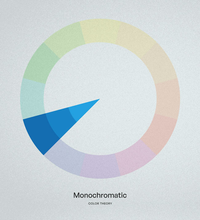
Monochromatic
A monochromatic color scheme uses different shades, tints, and tones of the same color. This creates a sense of unity and simplicity in a design. Monochromatic schemes work well for designs that need to convey a calm and elegant feeling.
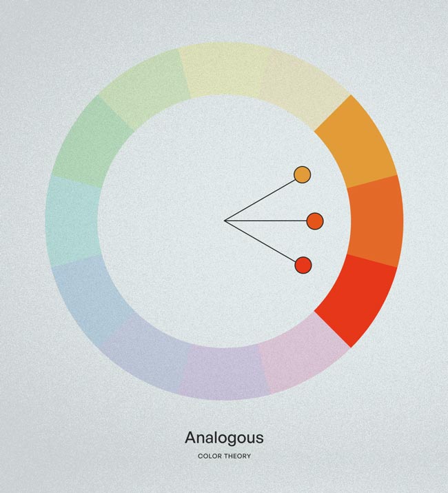
Analogous
An analogous color scheme uses colors that are adjacent to each other on the color wheel. Analogous colors create a sense of harmony and are pleasing to the eye. Analogous schemes work well for designs that need to convey a natural and comfortable feeling.
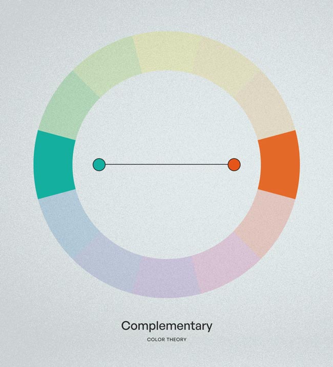
Complementary
A complementary color scheme uses colors that are opposite each other on the color wheel. This creates a sense of contrast and can be eye-catching. Complementary schemes work well for designs that need to convey a sense of energy and excitement.
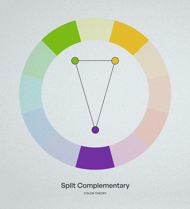
Split Complementary
A split complementary color scheme uses a color and the two colors adjacent to its complementary color. This creates a sense of contrast, but not as much as a complementary color scheme. Split complementary schemes work well for designs that need to convey a sense of energy, but not as much as a complementary color scheme.
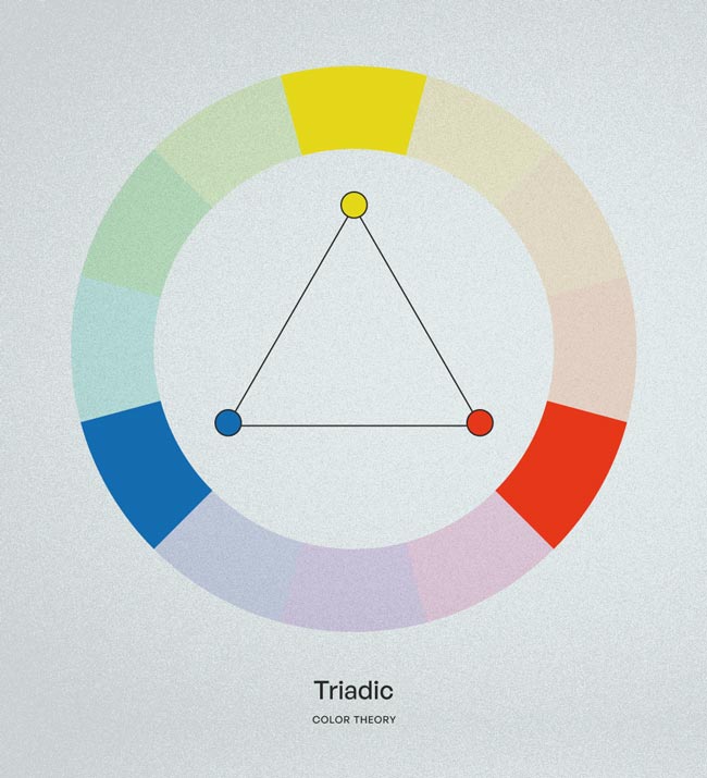
Triadic
A triadic color scheme uses three colors that are evenly spaced on the color wheel. This creates a sense of balance and is visually appealing. Triadic schemes work well for designs that need to convey a sense of playfulness and vibrancy.
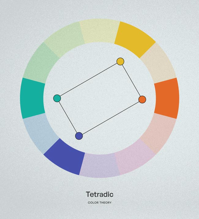
Tetradic
A tetradic color scheme uses two complementary color pairs. This creates a sense of contrast and vibrancy. Tetradic schemes work well for designs that need to convey a sense of excitement and energy.
How to Use Color Harmonies in Your Designs
If you adhere to some straightforward rules, using color harmonies in your designs can be simple. Initially, pick a color to serve as your base, and then pick the other colors from the color wheel that best suit the kind of color harmony you want to create. Choose a color harmony that best reflects the mood and emotion you want to evoke in your design. For instance, you might select a monochromatic color scheme to convey a calming and comforting mood.
Consider the harmony of the colors you’re using when using them. Use the other colors as accents or highlights and make the base color stand out more. To produce a more harmonious effect, you can also change the colors’ saturation, brightness, and contrast.
Tools to Help You Create Color Harmonies
To create color harmonies for your design projects, there are numerous tools at your disposal. Adobe Color, Coolors, and Color Hunt are a few of the well-known ones. Based on the kind of color harmony you want to achieve, you can use these tools to choose a base color and produce a color palette.
Common Mistakes to Avoid
There are some mistakes to avoid when utilizing color harmonies in your designs. One is the overuse of color, which can lead to confusion and a sense of chaos. Ensure that your palette contains no more than four or five colors. Another error is not paying attention to how the colors you’re using contrast with one another. Make sure there is sufficient contrast between the colors to produce a beautiful design.
Examples of Color Harmonies in Design
From graphic design to interior design, color harmonies can be seen in a variety of design contexts. Examples include:
- A monochromatic color scheme in a minimalist website design
- An analogous color scheme in a nature-inspired brand identity
- A complementary color scheme in a sports team logo
- A split complementary color scheme in a restaurant menu design
- A triadic color scheme in a children’s book illustration
- A tetradic color scheme in a festival poster design
Conclusion
Understanding color harmonies is essential for creating visually appealing and cohesive designs. By choosing the right color harmony for your project and using it effectively, you can convey the right mood and emotion to your audience. Remember to consider the balance and contrast of your colors and avoid common mistakes like using too many colors or not enough contrast. With these tips, you can create designs that stand out and make an impact.


